After I had set the basics down now all I had to do was bring in the drawing building and the birds. All the images i have used for my animation I have hand drawn and then edited on Photoshop to create a very bold image. I am very pleased with my animation, for a very simple idea and design i feel the overall effect has worked well. Now all i want to do is make another one!
Thursday, 5 May 2011
Step 1: "Red Beating Heart, Walking Figure and Crazy Background"
To begin my animation process I thought the best option was getting the basics in. Seen as the walking figure and beating heart are throughout the animation I started with creating the full 29 second animation with these aspects in the right order and with the right timing.
(So far so good!)
Wednesday, 4 May 2011
Final Storyboard
I've slightly altered my final storyboard using the new media styles I have chosen, however, the storyline is basically the same and the timings haven't had a huge difference to them.
Black background, gradually heart and figure revealed in time with the beats .
TWO = 0:035-0:04
Figure and heart completely revealed. (Heart still beating in time with music).
THREE = 0:04-End
Figure begins to walk.
FOUR = 0:09-0:24
City begins to draw itself. (Figure still walking and heart still beating)
FIVE = 0:24-End
Building is fully drawn in.
SIX = 0:26-End
Birds fly across the sky. Last frame is a black background.
Character Design: BIRDS
FAVOURITE
I felt this simple design was the best option. It is simple yet effective and will not distract the viewer from the rest of the animation. It will also be easily animated. As you can see i have produced three key frames for the motion of a bird flying which will be lopped for a realistic flight
Testing Lines
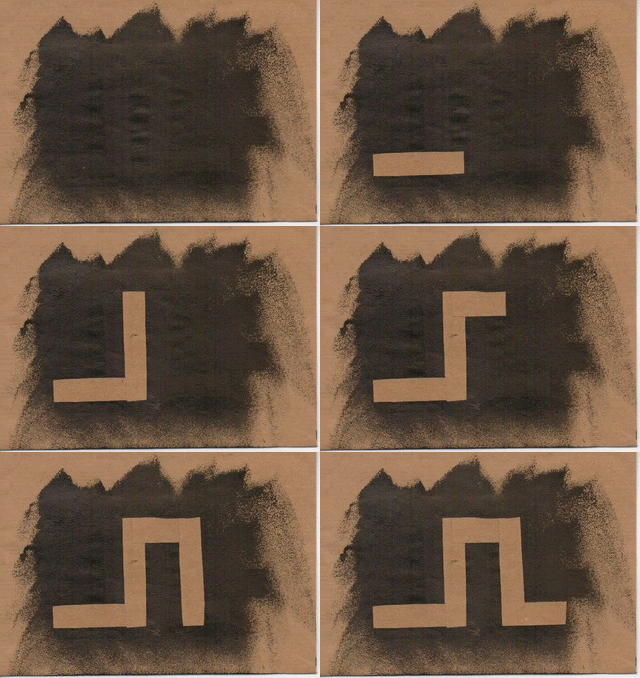
Due to me wanting to keep my animation hand crafted, I decided to test out different methods to create the feeling of the buildings drawing themselves into the image.
Gradually Painted In
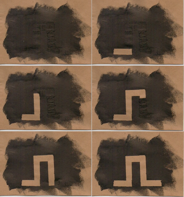
As my original idea to create the feeling that the buildings are drawing themselves in; I feel the effect works well. The only concern is you can see where lines have been painted over the image to cover it. The process also took a long period of time as each line had to be left to dry before scanned in.
Painted Blocks
Gradually Painted In

As my original idea to create the feeling that the buildings are drawing themselves in; I feel the effect works well. The only concern is you can see where lines have been painted over the image to cover it. The process also took a long period of time as each line had to be left to dry before scanned in.
Painted Blocks
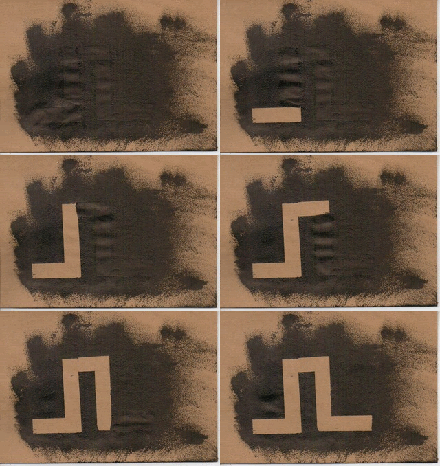
Again I chose to test the idea of painting in sections of the image to hind areas, however, this time I chose to allow each block to be shown at a time. Although the process was much quicker then painting it in gradually, I am not too keen on this idea because it feels very stiff.
Sponged In
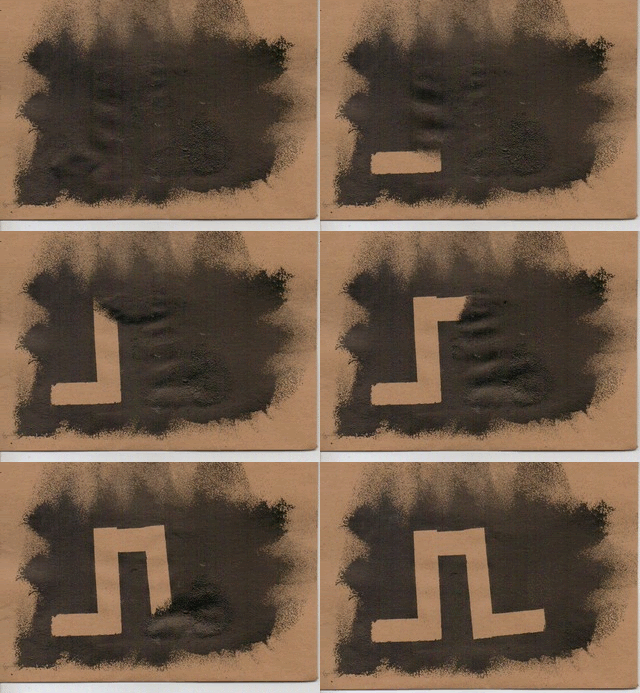
Seen as I had created sponge painted backgrounds i decided to follow this concept and gradually sponge in the image. I feel that the covered areas of the image were hidden a lot better compared to when i just painted it in; however, i am still not too keen on the idea! It appears more like the foreground is revealing an image underneath rather then the image drawing itself in.
Paper Mosaic
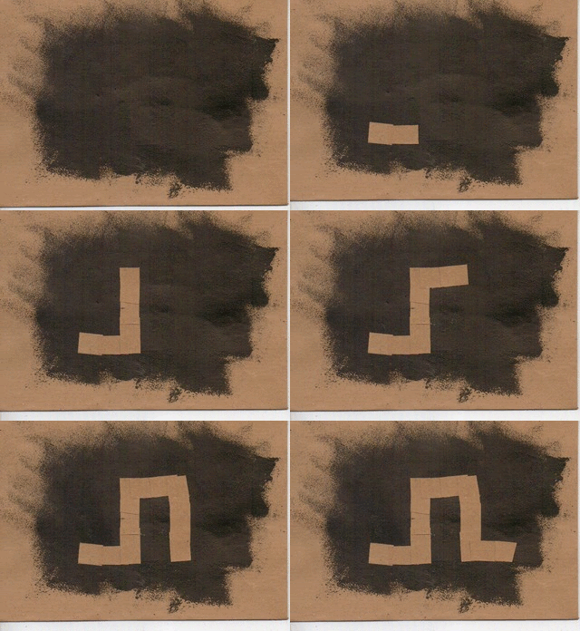
Definitely my favourite idea! There isn't any image "ghost' where you can see the image before it has appeared. I also love the messy feeling of it, i feel it adds even more to the idea of 'energy'. It appears very exciting and unplanned.
Paper Blocks
"The Drawing City"
I wanted to animate one of my previous city designs and chose to gradually paint the image out, scanning each section in and then fitting them together backwards so it appeared to be revealing rather then hiding the city. I think the idea came out well, definitely needs to be worked on for the final animation but i would say getting there.
City Design
So i needed to design a city view and my first thoughts was just a line drawing. I chose to animate the image to see how it works and just get a bit more practise with after effects.
I wanted to keep the theme of the sponging effect running though my animation so each component fitted well together rather then feel like they are separate. I applied this technique to my previous line drawing design and already I'm preferring the outcome.
 I then followed this principle onto brown paper, producing several different images, testing using wonky lines, buildings that join up and buildings that didn't. After a few attempts i concluded i preferred the use of straight lines such as the previous image and i felt the bottom needed to be joined up as to allow the feeling of it drawing itself in continuously.
 The Beginning Bit
One of the alterations I wanted to do was begin my animation as a blank background and gradually reveal the figure. I manage to to do this by masking the first few frames on photoshop.
Merging "The Heartbeat" With "The Walking Man"
My next step is to merge "The Walking Man" with the "Heartbeat". Only challenge is to keep the heart fixed in the figure and beating to the beats of the music. I first attempted to merge them together in after effects and soon discovered the great pain it was to keep the heart in a fixed position on the figure to appear inside it rather then on top. I needed to rethink this hand crafted concept and opted to using photoshop.
To begin creating the images I split each part of it up; the heart. the figure and the backgrounds. I produced several different backgrounds as to keep the fuzzy movement of them; the different positions of the walking on the brown paper and the heart. After scanning each section in it was down to work. I was very pleased with the outcome of each frame and when put together the animation was just how i wanted it. Everything in working order and portraying those words i initially thought of.

For the first stage of creating my animation I am very pleased. I want to alter a few things, such as beginning with a blank background and slowly the figure is revealed and perhaps change the colour of the heart to red. Now just to add the buildings and the birds.
"The Walking Man"
After researching the different frames needed to animate a walking man and reproducing then in a line drawing, i went ahead and redid the frames in the style i picked out from my character design, the sponged background effect. I also decided to do it on the brown parcel paper as a 'hit or miss' attempt and actually i am very pleased with how it came out. The paper definitely just adds that something more to the animation (it's a keeper).
I quickly drew out a simple storyboard for this animation, involving a start, middle and end. I wanted to begin the animation as a plain black background and with each of the beats the figure slowly appears. I plan the figure to begin walking when the guitar kicks in.
Roobarb And Custard
"Roobarb and Custard" is a British TV programme created by Grange Calveley (writer) and Bob Godfrey (animated).
I love how busy each frame is, nothing is ever static and i think this makes the whole animation very exciting and busy. Even with their simple drawings the animation is still interesting and an enjoyable watch. I would like to develop that idea of constant movement into my animation as it fits well into the idea of continuous and energetic.
Research: WALKING
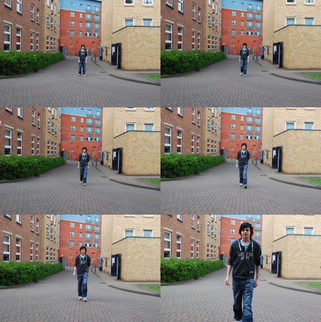
Seen as I am going to animate the figure walking i felt that researching into the different positions was a must. I borrowed a friend to walk towards me whilst i used a camera to take continuous shots. By doing so i aimed to discover a pattern which i could use to produce the frames needed to portray a realistic walking figure.
I used overlays to draw around the basic shape, gathering information of where the arms were positioned and the legs. I began to notice how the body also moves up and down slightly whilst walking, as well as the tilting of the body as the weight shifts from one side of the body to the other.
Character Design: FIGURE
 Seen as my idea is based around a man taking a stroll I decided to take a look at some character design. I began with designing different styles ranging from detailed figures which show the muscles to stick men and even robot style! I found I was fonder of the image in the top right of the page. This is because it is very simple so can be easily animated, however, still presents certain details which will be important when animating to walk. For example to the hands and feet.
  After deciding which figure to go for, I refined it slightly and began looking at different medias to produce it. I first began with simple pen drawings, looking at scratchy lines and plain, straight lines. I experimented with fill the figure in and using a coloured background to illustrate the image. I also experimented with charcoal. I prefer the pen drawings rather then the charcoal because, although would produce a very busy effect i feel produces a line which isn't strong enough for the man focus of my animation.
 After looking into the obvious ways of producing a drawing, I decided to experiment with concepts i learnt from our Observation and Communication module. I looked at creating stamps to produce the figure, using ink and acrylic.
Ink Stamps
I felt sometimes the final outcome was difficult to recognise and often came out messy with areas missing.
Acrylic Stamps
I like how using acrylic without adding water produced a a very unique effect on the image; it appeared almost like veins. Perhaps an idea to animate the beating heart, however, could be very hard to work with when the outcome is unplanned.
As well as using stamps, i created stencils which i then used to sponge around the figure and inside the figure.
Acrylic Sponged Background
Without a doubt my favourite. I love the texture left from sponging and how the the faded edges could be used to create that energetic feeling i felt in the music. The final figure portrays that unusual effect which the other ideas didn't.
Acrylic Sponged Figure
This idea looks very similar to the stamps, however, has a very different texture. I like how applying different pressures to the sponging technique can produce very different effects. When animated it would produce a very fuzzy and crazy feel because it would be constantly moving.
Story Board
After looking into different ideas and playing around with the order, i have finally concluded a finished storyboard for my animation.
ONE = 0:00-0:04
Large heart beating in time with music.
TWO = 0:04-0:08
Heart shrinks and a figure is drawn around it.
THREE = 0:08-0:12
Figure begins to walk. Perspective changes to a side view. (Heart still beating)
FOUR = 0:12-0:25
A skyline of a city begins to be drawn in the background. (Appears as if the figure is walking towards it)
FIVE = 0:25-0:30
A flock of birds flies in from the left side of the frame.
SIX = 0:30
Birds have moved across the sky out of the frame and at this point the animation stops.
Story Board Ideas
I brain stormed a few ideas of possible storyboards for my piece of music whilst listening to it.
I have decided to play around with the idea of someone walking through a city. I feel it portrays the music as exciting, adventurous and energetic (the latter of which is one of my describing words). I am also incorporating the heart beat which i intend to fit in time with the constant background beat, following the them of continuous.
Using post-it notes I played around with an order of my storyboard.
ONE = figure (front view) - beating heart - walking figure (side view) - buildings - sun - birds
TWO = walking figure (front view) - beating heart - buildings - sun - birds
THREE = figure - walking figure - beating heart - buildings - birds
FOUR = buildings - figure - beating heart - walking figure - sun - birds
FIVE = beating heart - figure (front view) - walking figure (side view) - buildings - birds
I have decided to use number FIVE as i feel it fits the music better, such as in the beginning there is just the constant beat which would be represented by the heart. I chose to disregard bringing the sun into the animation and just keep to the birds, otherwise I feel too much would be going on. I aim to keep it simple yet effective.
"Heartbeat"
 When listening to my track, the continuous beat i first spotted reminded me of a beating heart. I decided to research the heart, using anatomy books i picked up from the library; as to enable me to draw a heart and animate it to appear beating. THE HEART = An organ which supplies blood and oxygen to the other parts of the body. Roughly the size of a clench fist it is the strongest muscle in the body. It is located in the chest between the lungs and uses arteries to pump blood away from itself and return blood through veins.
 This is my final heart drawing which i concluded from research. Simple and done in charcoal, however, if used in my final animation i will be designing it using pen to keep with the line drawing theme.
I successfully managed to animate my drawing to appear beating. I used four different drawings which I placed on a continuous loop.
(Frame used)
Rayograms
I found this session very interesting and was definitely fun to test out a different creative media, however I don't think i will be using this technique for my final animation.
"Heart Grows Fonder"
 After looking at the work of J. Stuart Blackton, i decided to trail the idea for myself. I designed a simple line drawing, which i then drew out again scanning the image each time i drew a small section of each line. In total it involved around 120 images to produce, which i then put together in After Effects.
  Before putting my animation together i quickly planned out a story board. To begin with only the girl is on screen. The large leaf and the left flower will then begin to be drawn and eventually the right flower will begin along with the vines. Once all the floral is drawn, the clip will be ended with a simple butterfly being drawn. When creating this animation, it reminded of the song "Mango Tree" by Angus and Julia Stone, which i later added to the final animation to enhance the feeling of beauty and serenity.
 (When I have more time i would really love to finish this of! I feel it has an abrupt finish and i need to add more to it)
Research
WOW! When I first saw this video I was amazed. It was created by graffiti artists whose general work is fabulous anyway. I am fascinated by how they managed to do this and how long it would have taken to create! I particularly love how the image appears to be drawing itself, an idea I may have borrow for my animation.
www.blublu.org < CHECK THEM OUT!
Subscribe to:
Comments (Atom)


